Can AI Be Used to Check Stop Control Warrants?

person at a computer with back to viewer

For some time I have been thinking about how AI could be used to assist civil engineers and the public works industry. While I have several ideas, one obvious application I’ve thought about is using it to check all-way stop control signal warrants as defined by the Manual of Uniform Traffic Control Devices (MUTCD). Since I was taking a class in AI with homework asking us to create our own GPTs using ChatGPT, I figured I’d use this opportunity to try out the MUTCD stop warrant idea. While an analysis by AI obviously cannot be used in place of an actual engineer’s analysis, I thought others might be interested in seeing the result of this test of its abilities.

I’ll include below the results so even if you don’t have a subscription to ChatGPT you can see how it performed. If you subscribe to ChatGPT, you can try it on your own at by uploading a txt file with data similar to my example below using the “Stop Control Warrant Analysis” GPT – this is different from using ChatGPT as it is a custom GPT I created specifically to analyze stop control warrants per the MUTCD.

To use it I first prepared a text file with the data I figured the GPT would need to perform the analysis. This is the information I put into a TXT file using Notepad then saved it. By the way, this is all made up information for a fictitious intersection:

Name of Intersection: Main and 22nd
Intersection Location: Anytown, IL
Minor Street Name: 22nd street
Major Street Name: Main street
Number of legs in the intersection: 4
Number of crashes in a 12-month period: 40
There is adequate sight distance.
An all-way stop control could not serve as an interim measure.
The number of units per hour in a typical 8-hour day on the major street is 5000
The number of units per hour in a typical 8-hour day on the minor street in that same hour is 300.
The 85th percentile speed limit is not over 40 mph
There is a need to control left turns
These are not through residential collector streets.
Pedestrian and/or bicyclist movements support the installation of all-way stop control.

Next I went to the Stop Control Warrant Analysis GPT and typed in this prompt: “Can you help me figure out if my intersection needs a stop sign? I have attached a text file with my data.” And I uploaded my TXTfile. Below is a screenshot showing this along with the output from the GPT.

Screenshot of GPT output
Output from Stop Control Warrant Analysis GPT – click the image to enlarge it.

I tested it again by starting a new session and uploading a new text file with slightly different data noted below – again all fictitious:

Name of Intersection: River and 22nd
Intersection Location: Anytown, IL
Minor Street Name: 22nd street
Major Street Name: River street
Number of legs in the intersection: 4
Number of crashes in a 12-month period: 4
There is not adequate sight distance.
An all-way stop control could not serve as an interim measure.
The number of units per hour in a typical 8-hour day on the major street is 150
The number of units per hour in a typical 8-hour day on the minor street in that same hour is 100.
The 85th percentile speed limit is not over 40 mph
There is not a need to control left turns
These are not through residential collector streets.
Pedestrian and/or bicyclist movements do not support the installation of all-way stop control.

Below is another screenshot showing my prompt and the response:

screenshot of output of GPT
Output from Stop Control Warrant Analysis GPT – click the image to enlarge it.

For each you can see I have asked the GPT to add the language at the end so if anyone tries this they realize it cannot be used in place of an actual analysis by a professional engineer. I only set it up to test out how well it might work with completing this type of analysis and would not want anyone to think it is doing actual engineering – it isn’t. There also might be better ways to use other technologies to do the same thing. However, all of this was done just by telling it what I wanted it to do and giving it the information it needed to do it.

In the future I will continue to test out different applications to see how useful it might or might not be. And if I have anything that looks interesting I’ll continue to share here. If anyone else has tried creating something for engineering or public works, I’d also be very interested in exploring it.

Share

A Short Story of Catastrophic Land Subsidence and Jonas’ Lake

The other day a colleague told me about a bean field in Polk county, Minn., which catastrophically dropped 25 feet. After watching the video I noticed the land was located near a river, and the video points out that the land also seems to be pushing into the river. It made me wonder if some types of geographical features I had thought developed gradually over time instead occasionally occur all at once as this did. And now will this sunken area present to the river a path through which a new meander of the river may be created?

Then today in reading the history of Richland county, Ohio, I came across another story of a catastrophic drop in land which occurred in 1846 in an area about seven miles east of Mansfield. The area is now covered by several acres of water and is called Sites Lake – a small lake lying close to and north and east of the much larger Charles Mill Lake. But according to the history, Sites lake, which used to be called Uncle Jonas’ Lake, was at one time only about an acre in size. The story explains that the area around the lake, amounting to about eight acres, was very flat and rimmed with “hills of gentle slope.” So the owner of the property, who was the Uncle Jonas after which the lake was named, decided he would drain the lake and recover an extra acre of farm ground. To achieve this goal, he cut a ditch through the only break in the hills lying around the flat acreage so the water could drain from the lake to the “Black Swamp” which lay to the east. He completed his work on July 25, 1846, and successfully lowered the water level by eight feet.

Imagine Jonas’ surprise when instead of gaining more flat, dry land, he found the flat area around his lake had dropped and became flooded with water. Only the tops of trees could be seen and eventually over time even these too sunk out of sight increasing the size of the lake to six acres. Neighbors from miles around reported feeling a “quake and tremble” at the time the land catastrophically sank. Then, through the years, the land continued sinking until eventually the lake reached a size of eight to nine acres.

Later in the 1900s work was done to significantly develop the area around Uncle Jonas’ Lake. Today it is dwarfed by the much larger Charles Mill Lake which, according to the Charles Mill Lake website, is 1350 acres in size.

Google map view of Mansfield Ohio and Charles Mill Lake to the east.
A map showing Charles Mills Lake which is located about seven miles east of Mansfield, Ohio. Uncle Jonas’ Lake is one of the smaller lakes lying just to the north and east of Charles Mills Lake. Uncle Jonas’ Lake is now called Sites Lake. Source: Google Maps.
This map shows the location of Uncle Jonas’ Lake, now called Sites Lake, just north and east of Charles Mill Lake in Section 15 in Mifflin Township. Source: National Map.
Share

Noncompliant ADA Facilities – Playground Access – How would you fix it?

Noncompliant curb ramp at a park

The other day I was visiting a community in Illinois for the day and met a local person  who was very excited about the new playground equipment being installed in his neighborhood. He encouraged me to check it out since he said it was the first time the community had upgraded the site since his children, who are now adults, had been little. So I took a walk to the park only to find unfortunately we are still not constructing ADA compliant facilities decades after laws and guidance have been in place to assist us in these efforts.

Noncompliant curb ramp at a park

I’ve included the photos I took of the site showing the designer seems to have intended to install two accessible points off the shared use path running adjacent to the playground (the skidsteer is parked on the path). As you can see in the photos, one ramp, in the photo directly above and below, has side slopes down to the ramp which are not compliant with the 10:1 slope. The other is a ramp, shown in the very first photo, which has side slopes leading down from the ramp at an angle which are much steeper than the 10:1 ratio. This ramp also seems to have a much steeper running slope than 12:1 slope at the very end for the last 6 to 12 inches. Each ramp as constructed has areas where a wheelchair could tip due to the steep slope.

Noncompliant curb ramp in the park

I first thought perhaps the designer was worried putting in the required 10:1 slopes (see image below showing standard) could cause the ramp to be moved over and conflict with a swingset. So I asked myself, how would I have designed it, and how would I fix this now? I like asking this when I see something I think is noncompliant because sometimes achieving compliance can be a real challenge – sometimes there is not always an easy solution. Understanding how others have approached design challenges helps me become a better designer.

Curb ramp side slopes from ADA Standard 2010
Curb ramp side slopes from 2010 ADA Standards

However, at this particular site, I believe there is a much better design that would be a lot safer and provide even more accessibility. Once I realized this, I wondered why the original designer had not just done it that way in the first place since it seemed a more obvious solution than what had been chosen. And while some of the completed work would have to rebuilt to incorporate my redesign, it would definitely be worth fixing it now before the project is finished if this will be in place for another 20+ years.

I was going to describe what I came up with, but rather than explain what I would have designed, I was curious, what would be your fix?


Share

Is it Really Climate Change or is it Sewage?

Fox River Sept 2015

Fox River Sept 2015
Fox River Sept 2015

Lately I’ve seen several presentations which all include a similar slide with a graph like the generic one I created below. All the presenters then refer to the graph on the slide and make a statement similar to this: “and because of climate change you can see an increase in flooding over the last several decades.” But with no supporting data ever offered to attribute this trend to climate change, these graphs have instead made me think the cause is most likely sewage.

Graph - for example only; not based on actual data
Graph – for example only; not based on actual data

So how do I get sewage out of this? Well, first it helps to have a background in the history of water distribution and wastewater treatment in the U.S. While some major cities began piping water to homes in the 1800s, construction of water distribution systems didn’t began in most areas until the early 1900s.  At this time, wastewater in most areas was still discharged without central collection or treatment. According to Urban Wastewater Management
in the United States: Past, Present, and Future, “By 1905, more than 95 percent of the urban population discharged their wastewater untreated to waterways. Little changed over the first quarter of the twentieth century,
and in 1924 more than 88 percent of the population in cities of over
100,000 continued to dispose of their wastewater directly to waterways.” Because this led to a non-centralized system, sewage was sometimes sent directly to a stream from multiple outlets and sometimes dispersed over land to eventually make its way to a stream.

All this began to change in the mid-1900s. The same publication cited above also noted Congress enacted  “the Water Pollution Control Act of 1948. The legislation provided for comprehensive planning, technical services, research, financial assistance, and enforcement. The Water Pollution Control Act was extended in 1952 and became permanent legislation in 1956.” There was a 1965 amendment to this act, and then eventually in 1972, Congress passed another Water Pollution Control Act.  The paper points out “the 1972 Act set the unprecedented goal of eliminating all water pollution by 1985 and authorized expenditures of $24.6 billion in research and construction grants.”

The result of this flurry of legislative activity between 1948 and 1972 resulted in the installation of centralized wastewater treatment systems in urban areas across the U.S. Today all discharges from each of these systems are regulated through permits from the USEPA primarily for water quality control. The discharges are typically introduced to a stream or other body of water directly from the treatment plant. Treatment discharges have the potential to range from less than 1 million gallons per day (MGD) to 1.44 billion gallons per day. That’s a lot of water entering our streams on a continuous basis which is why I immediately thought of wastewater as a cause when I saw the graph trending up after the mid 1900s.

Wastewater clarifier

Another reason I suspected wastewater had a major impact on stream flow was based on something I heard regarding the river flowing through our city. It seems in the past, people could walk across the river in the summer. As you can see in the photo of this river which I included at the start of this article, walking across the river today would most likely never be possible. In hearing this, there was no question in my mind that this was due to the wastewater discharges which now regularly flow into our river  and increase its base flow.

So during the last presentation I attended, I asked if impacts from wastewater discharges were considered or analyzed to see how much these flows are contributing to increased flooding. I explained if prior to installation of wastewater treatment plants, base flows of rivers could reduce to almost nothing, these streams would have had more capacity to handle rainfall events. But now with increased base flow due to wastewater discharges, which really started entering streams between 1948 and the 1980s and continue to do so and increase, the ability of streams to handle rainfall events has decreased. This could be a cause of rainfall events impacting greater areas and resulting in increased damages in suburban areas.  Also, as this USGS site shows, How Much Water Do We Use?, public water supply usage has increased over the years which would increase wastewater discharges even more. The presenter said they had never looked at the impacts of wastewater discharges.

As I continued to wonder about this, I looked online to see if others had thought of the impact of wastewater discharges on flooding events and discovered yes, they have. I even found studies which were done on the river in my community. H. Vernon Knapp, senior hydrologist with the Illinois State Water Survey, has developed at least two studies for the Fox River in Illinois which related to this topic. In his paper, the “Fox River Basin Streamflow Assessment Model: Hydrologic Analysis, October 1988,” he  analyzes the river flow taking into consideration impacts from effluent discharges from wastewater plants along the river. According to Knapp, in 1988, “approximately half of the low flows in the river upstream of these plants originated as effluent discharges from other facilities. Under these circumstances, the capacity of the Fox River to assimilate the additional effluents should be of concern.” His paper is also informative regarding other factors which can impact stream flow.

More recently Knapp developed a presentation, Effects of Future Water Demands and Climate Change on Fox River Water Availability. In it he states “watershed modeling suggests that the potential effect of climate change on Fox River low flows is considerably less than the effects of effluents and withdrawals, and thus does not substantially alter the water supply potential of the river.” He also notes “low flows in rivers such as the DesPlaines are almost 100% effluent.”

Perhaps not all increased flooding in all watersheds can be directly attributable to increased wastewater discharges since the 1940s, but I’m surprised it’s not always at least considered. Instead increased flooding events have been attributed to climate change, yet I could find no study which directly proves this. Most studies only look at the extent of flooding and make the leap with no specific data to back up the claim that this is due to increased precipitation brought on by climate change. A few studies I found also indicated there are too many factors other than just precipitation, such as antecedent water content, soil type, topography, etc., to conclusively make a direct correlation between increased rainfall and increased stream flow.

In the future, I hope to find more studies which do take into account the impacts of wastewater effluent on river flow and flood events to see if others have findings similar to Knapp’s.


.

Share

ArcGIS Pro – My New Favorite Software

ArcGIS Pro ScreenShot of 3D Map

As a public works professional, one of the best things you can do in the new year is to check out ArcGIS Pro – a GIS mapping software by ESRI. I admit, like many GIS software products, ArcGIS Pro can be a little overwhelming to use right out of the box. Even though I am a regular user of ESRI’s older product, ArcMap, the user interface was nothing like what I was used to and the workflows somewhat different. But after trying it out for a few weeks, I have found ArcGIS Pro offers more effective features that increase flexibility, capabilities, and ease of use. It was definitely worth taking the time to figure it out.

If your workplace does not yet have a subscription, you can download a free trial to try it out. Because the new software is so different from past products, I went through the great tutorials ESRI has on their website to help me learn the software. After completing these trainings, I felt confident in making the switch to ArcGIS Pro for all of my GIS work.

The best way to explore what ArcGIS Pro offers is to download the software and use it yourself so I won’t try to lay it all out here in this post. Instead I included a few screenshots from the tutorials so you can get an idea of the layout and look. The data displayed is for Wellington, New Zealand and is provided by ESRI for use in the tutorials.

In the screenshot below, you can see the menus are displayed across the top in a manner similar to other Windows-based products. A content window is located on the left and lists the data included in the map. When you start accessing other menus such as catalog or symbology, they will show up in this same space. Then you can switch between them by clicking the tab for each located at the bottom of the window. In this image, I only have the content and catalog menus open.

ArcGIS Pro ScreenShot of Map
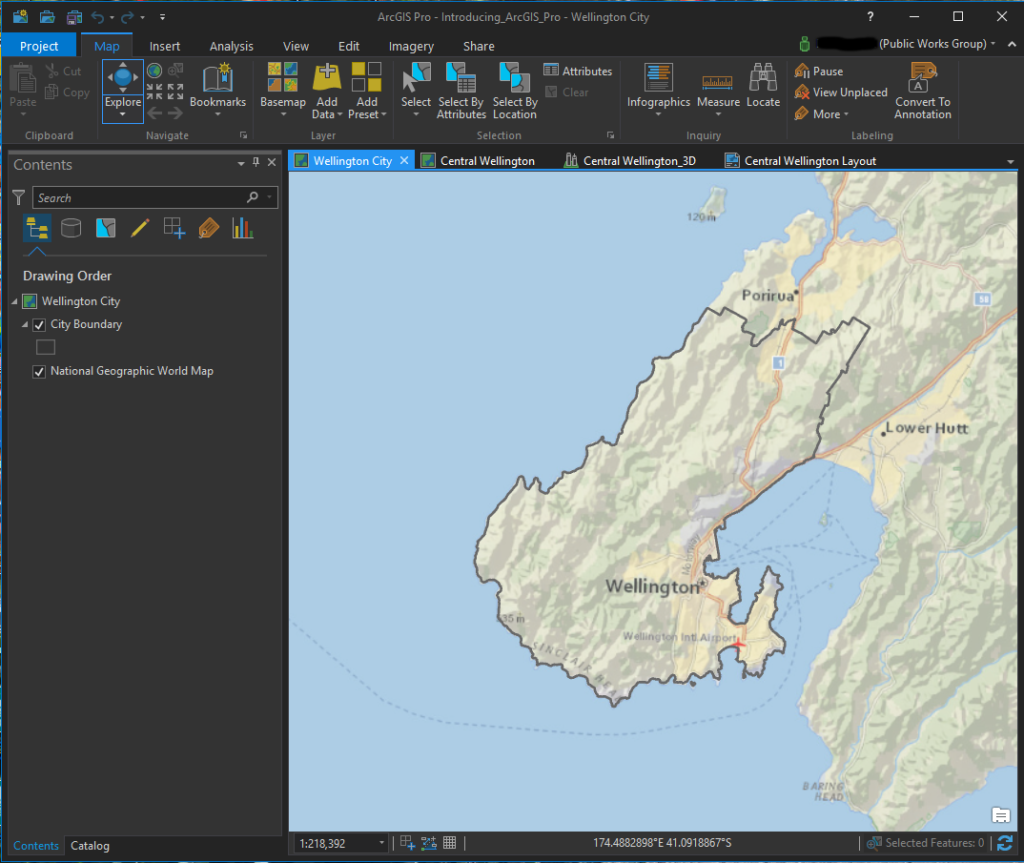
ArcGIS Pro screenshot of a 2D map

You can also see in this image several tabs shown above the map window. This is because ArcGIS Pro allows you to create multiple maps and layouts as a project rather than just creating one map at a time. With this format it is easy to switch between maps and layouts and copy data from one map to another. In the image below, a layout for this project is displayed.

ArcGIS Pro ScreenShot of Layout
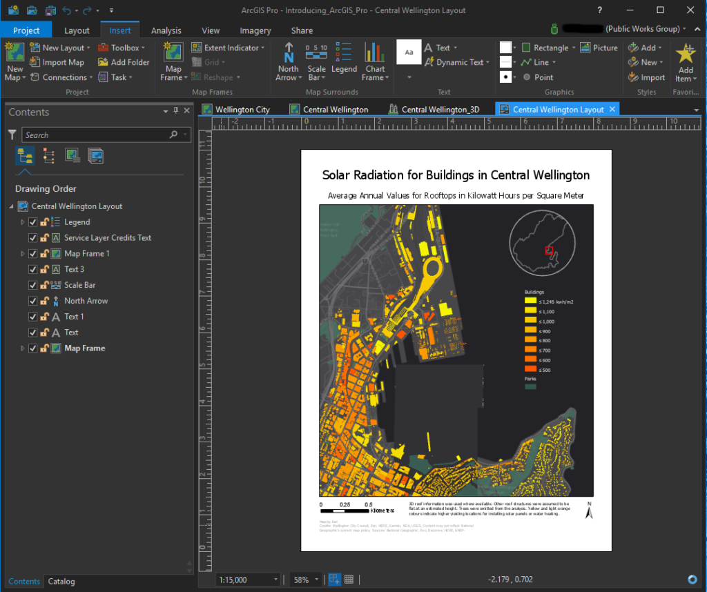
ArcGIS Pro screenshot of a layout

The other feature I really like is the ability to easily create 3D maps. Below is another screenshot of a map showing buildings in Central Wellington, New Zealand. This map displays the same data as shown in the layout in the image above, but in a 3D format. I clicked on one of the buildings to get a pop-out window of the information stored for that structure. Also I had changed the basemap to get an aerial view which displays more of a picture of the ground.

ArcGIS Pro ScreenShot of 3D MapArcGIS Pro screenshot of a 3D Map with data displayed

Finally in the screenshot below, I had clicked in the Analysis menu to display some of the tools available. You can customize these display windows to show tools you frequently use.

ArcGIS Pro ScreenShot of Analysis Tools
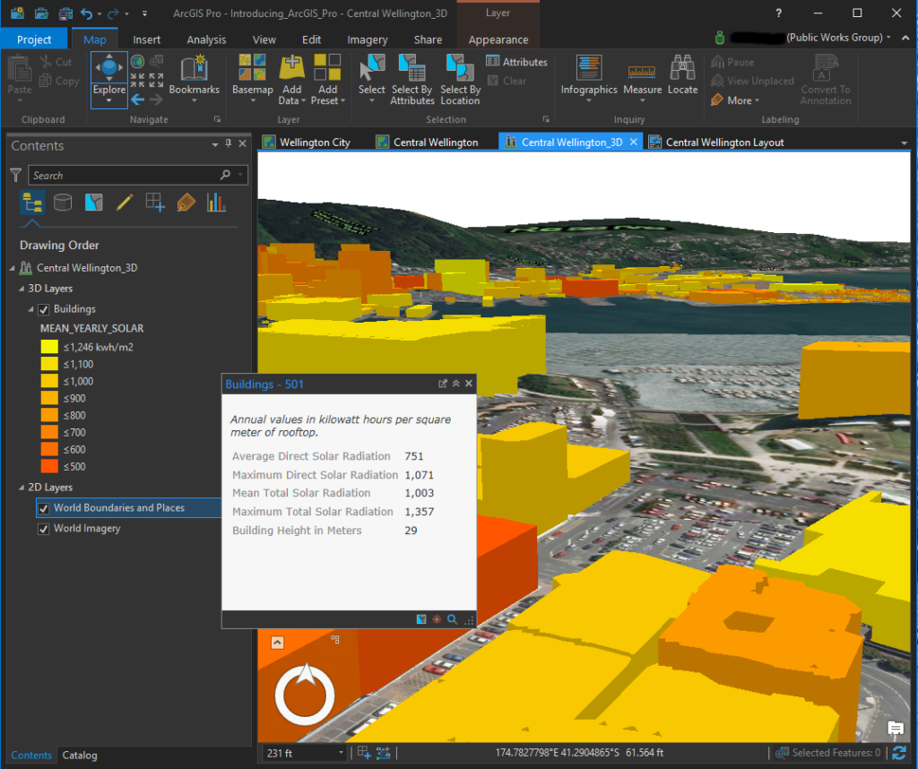
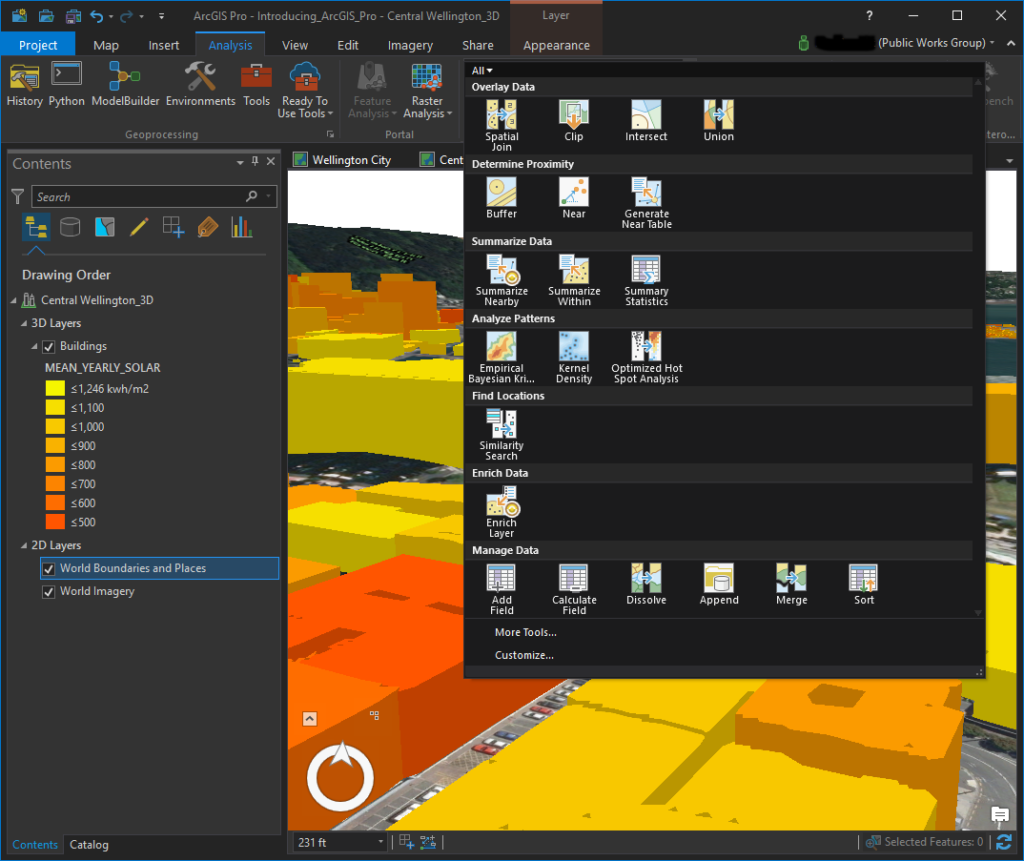
ArcGIS Pro screenshot of available tools in the Analysis menu

Another added bonus with ArcGIS Pro is the integration ESRI included between the software and ArcGIS Online. With the Share menu, you can easily copy your maps to your ArcGIS Online account where they can be displayed as web maps or used to create other applications such as story maps.

To give you an idea of why being able to easily share to ArcGIS Online is so important and powerful, I included just a couple examples of maps created and shared through that online service. The first is a very useful map created by the Maryland DOT. People can use this web map to figure out which entity has maintenance responsibility for any road in the state:

Maryland DOT Maintenance Responsibility Web Map

Another great example is this story map of public transit in Melbourne, Australia. This particular application displays a lot of the features and capabilities offered by story maps:

Melbourne Australia Transit Story Map

Finally, if your office doesn’t offer ArcGIS Pro for your own use or your free trial runs out, ESRI offers a fairly low-cost subscription option for people who just want access to the software for personal, non-commercial use. You can find out more about ArcGIS Pro for personal use here: http://www.esri.com/software/arcgis/arcgis-for-personal-use


Share

National Institute of Building Sciences Updates Mitigation Savings Ratio

Elevated House

On January 11, 2018, the National Institute of Building Sciences released their Natural Hazard Mitigation Strategies: 2017 Interim Report. This document reports an update to their 2005 determination of a mitigation benefit cost ratio of 4:1 where “for every $1 spent by FEMA on hazard mitigation, it is $4 in future benefits.” The new study has found this ratio has increased to 6:1 meaning “on average, mitigation grants funded through select federal government agencies can save the nation $6 in future disaster costs, for every $1 spent on hazard mitigation.”

The new study also broke out benefits of exceeding specific requirements of the 2015 model building code. It reports that, “on average, investments in hazard mitigation measures that exceed provisions of the 2015 model building code can save the Nation $4 for every $1 spent.”

While having additional data explains some of the finding of increased savings, there are other reasons this ratio is reported to be higher than the 2005 ratio. The newer study took a more in-depth look at costs and benefits and leveraged better analytical technologies.  This approach allowed for the inclusion of additional factors not considered in the 2005 study such as the following benefits and costs:

  • Benefits associated with avoided cases of PTSD.
  • Cost of lost wages
  • Losses in household productivity
  • Cost of pain and suffering

Another difference is the new study uses a discount rate of 2.2%. But even though this rate is below the higher discount rate used by the Office of Management and Budget, the study reports the measures remain cost-effective at the higher rate. This study also took into account information from 23 years of grants from EDA and HUD while the original analysis only looked at grants from FEMA.

You can read more about the entire study and findings at the National Institute of Building Sciences Website.  At this link you will be asked to provide your name and some brief contact information to download a summary, the full report, and fact sheets.

Share