At work we've been focusing a lot on development of web maps. We have an ESRI ArcGIS Server so we've been trying out the JavaScript, Flex, and Silverlight options available. But we've also been exploring the mapping/GIS opportunities offered by Google. This week, I needed to create an embeddable map that I could easily generate and place into a website. So I looked online for how to take our GIS data and get it published on a Google Map. I realize this can be done using a KML file, but I really wanted to use the Google Fusion Tables to display the data in map form. And I just could not find a set of clear directions on how to do this. Perhaps my search skills are lacking, but after coming up with nothing, I spent some time figuring it out myself using the few clues I could locate online. And because we have quite a few people at work who also use GIS and might want to publish their data on Google Maps, I decided to create a guide of how to do this. There might be an easier method or one that is not so conservative of an approach, but I know this works, and it didn't blow anything up. And since I already had the work done, I figured I'd share it here too in case it might also help others out.
Publishing GIS Data to a Google Map Using Fusion Tables
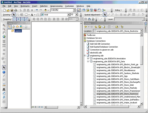
Open ArcMap, and create a new, blank map. Then open ArcCatalog in ArcMap and browse to your data. Drag the file with your original data into ArcMap.
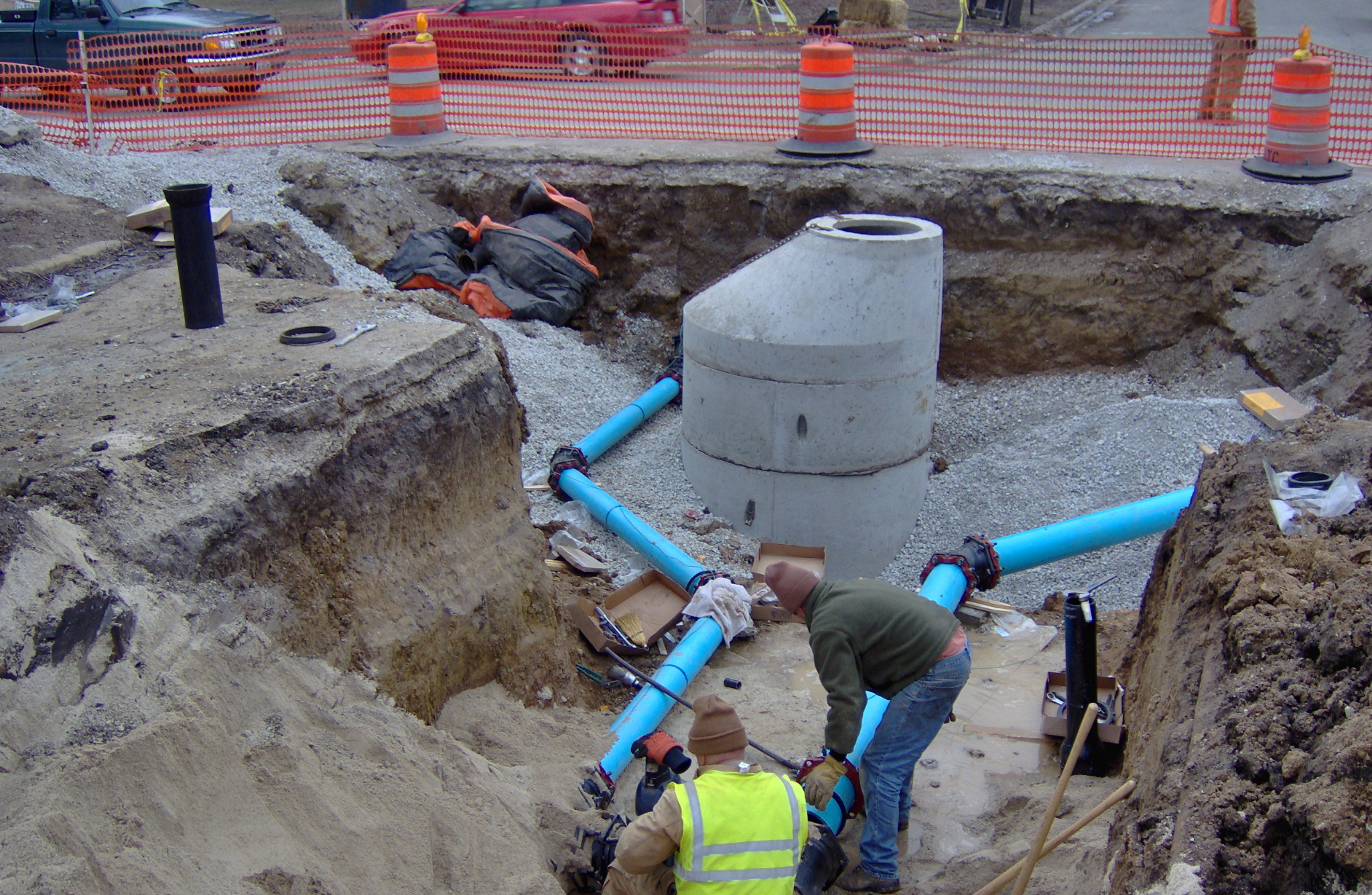
(In my example, I am using our Stormwater Restrictor feature class. This feature class was created from a set of data points collected in the field using GPS and processed in the office to create this file. It was then added to our engineering SDE Geodatabase. I also obtained some of the information about calculating fields from this blog post: http://nativecho.wordpress.com/2011/04/12/arcgis-10-0-calculating-geometry-to-display-decimals/)
Checking the projection of your data
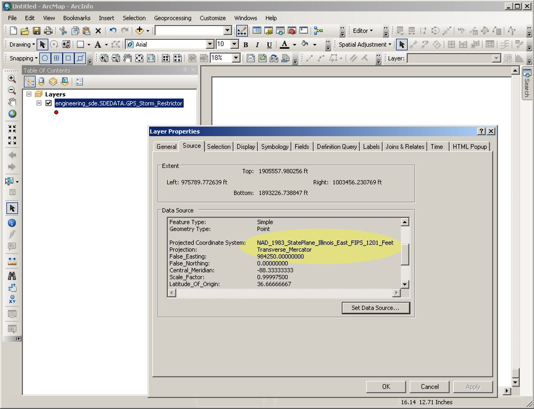
Because your original data is probably not in the same projection used by Google Map (WGS 1984 Web Mercator), you will need to re-project your data. You can check to see what system your data is on by right clicking the name of your feature class under “Layers” and choosing “Properties” from the pop-up menu. Click the “Source” tab in the Layer Properties window to see the Projected Coordinate System. When you are done viewing the projection information, cancel out of this window without taking any action.
Our data is on the NAD_1983_StatePlane_Illinois_East_FIPS_1201_Feet Projected Coordinate System—Transverse Mercator:
Creating a new shapefile from your original data
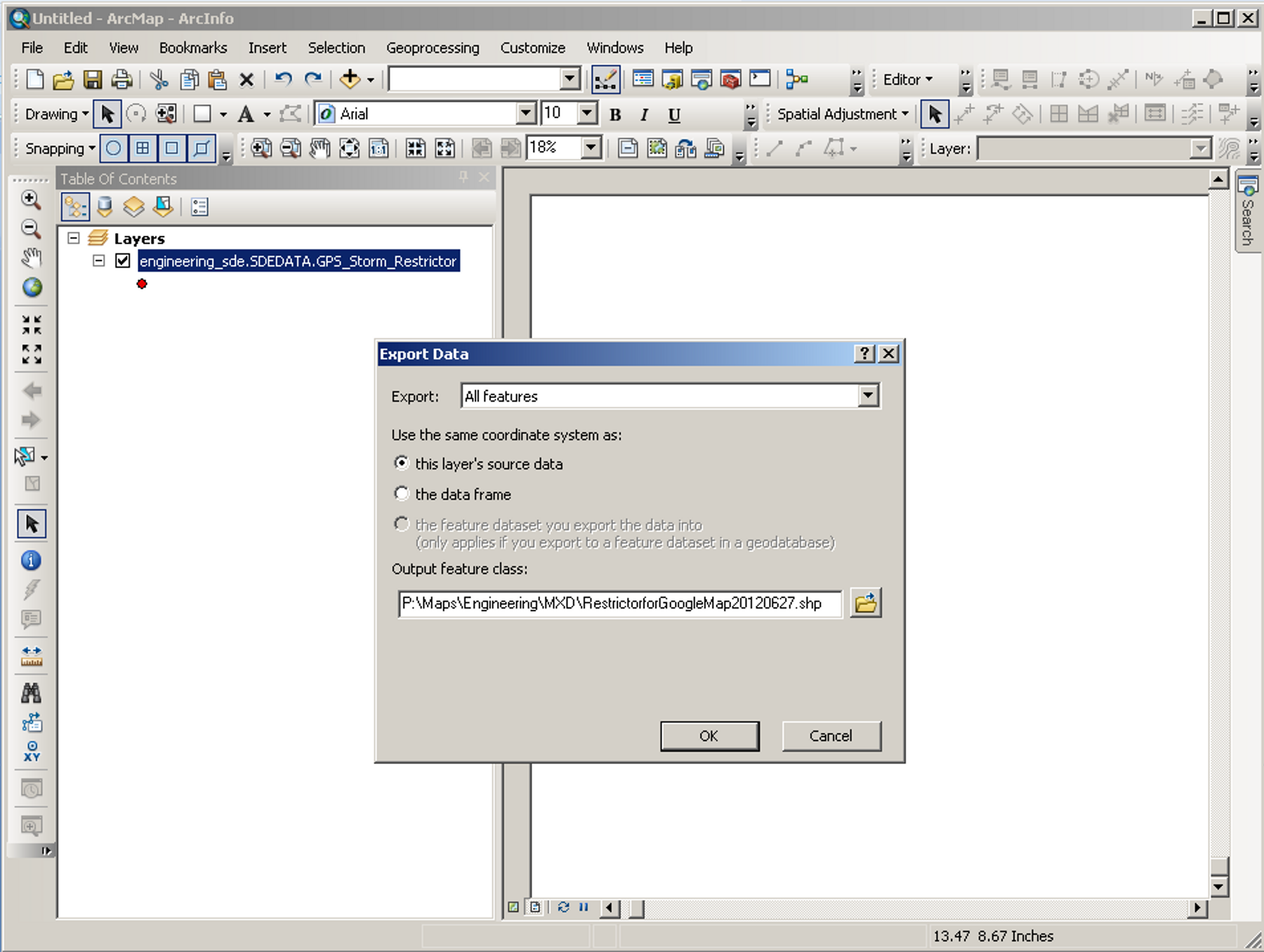
Because I do not want to change my original data or work in the geodatabase, I am first going to export my data to a shapefile. To export, right click the name of your feature class in the Table of Contents window in ArcMap. Then choose “Data” and then “Export Data” from the pop-up menu. For the “Output Feature Class” navigate to a folder location where you would like to store your shapefile. Choose a name for your shapefile; then hit “OK.”
This will create a shapefile you can work with so you will not change your original data.
Next, close this map without saving and create a new one. Open up Arc Catalog in ArcMap and navigate to your new shapefile. Drag this into your new map and close out of ArcCatalog.
Re-projecting your data
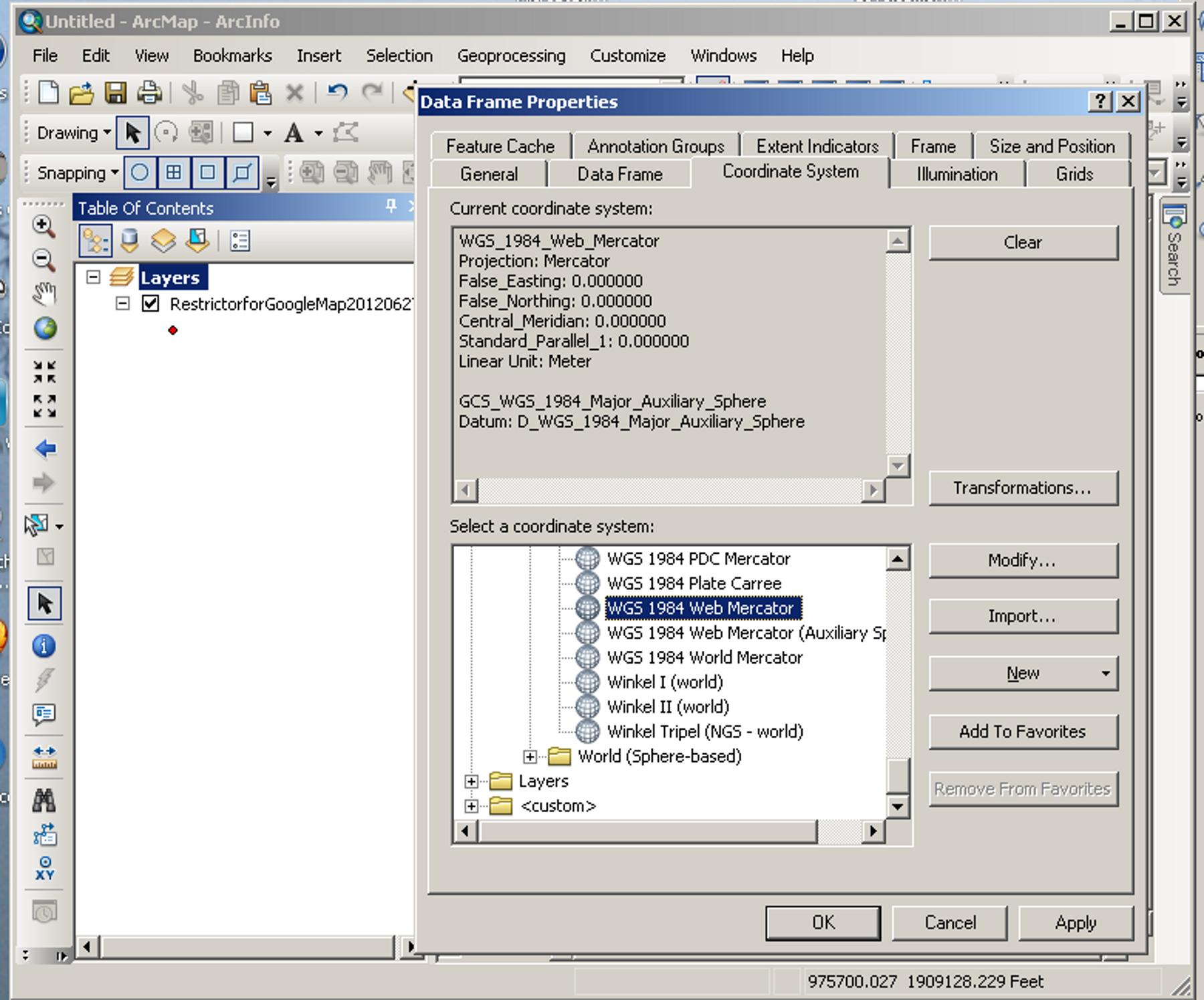
We are now going to change the projection of the data in your shapefile. First right click the word “Layers” in the Table of Contents window in ArcMap. Choose “Properties” from the pop-up menu. Then choose the Coordinate System tab. The top window is showing your current projection for the data frame of your map. You can select your new projection from the window at the bottom. Navigate to “Predefined,” then “Projected Coordinate Systems,” then “World,” and finally to “WGS 1984 Web Mercator.” This is the projection used by Google Maps. Make sure that projection is the one highlighted as shown in the example, then click “OK.” Note that when you highlight this projection, it will change the display in the Current coordinate system box as shown in the image below. After you click “OK,” a Warning window might pop up—just choose “Yes” to indicate you wish to use that coordinate system.
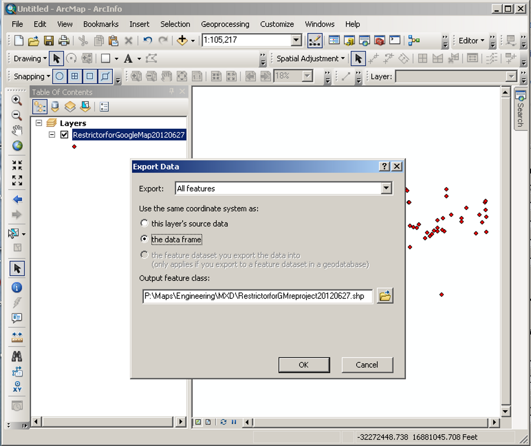
Now you will right click on your feature class name in the Table of Contents window and again choose “Data” and “Export Data” from the pop-up window. This time, make sure to change the choice of the coordinate system to “the data frame” as shown in the image below. Navigate to where you want to save your new file, and choose a name for this new, re-projected shapefile. Then click “OK.”
Adding latitude/longitude fields to your shapefile
Now we will close out the map without saving and create a new map. Open ArcCatalog again in ArcMap and navigate to your new shapefile. Right click on the new shapfile (in my example it is “RestrictorforGMreproject10120627.shp”) and choose “Properties” from the pop-up menu. Choose the “Fields” tab in the “Shapefile Properties” window. Then scroll down so you are viewing the bottom of the list of the fields. Here we will add two new fields, one for Latitude and one for Longitude, as shown below. Make sure the Data Type is “Double” and keep the default values of “0” for Precision and Scale. Click “OK” and drag the shapefile into your new map. Close out of ArcCatalog.

Setting up the latitude/longitude fields
Now we are going to work towards calculating the Latitude and Longitude for each point in our feature class. Right click on the name of your feature class in the Table of Contents of the new map. Choose “Open Attribute Table” from the pop-up menu. In my example, the attribute table is docked above my Table of Contents and my map window. In the attribute table navigate over to the Latitude and Longitude fields. They should have 0 for all the entries. Click on the top of the column on the word “Latitiude” in the column heading to highlight the field. Then right click and choose “Properties” from the pop up menu.
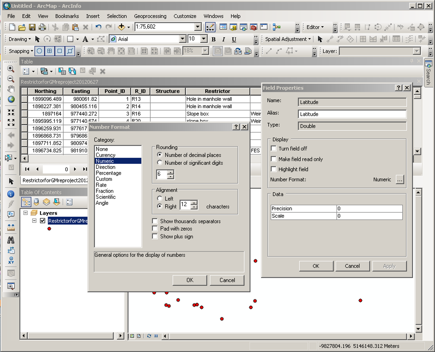
This will bring up a Field Properties window. In this window there is a box next to the word “Numeric.” Click that box with the “. . .”—this should bring up a “Number Format” window. In this window make sure the Category is “Numeric” and the Rounding is shown to at least 6 decimal places. Then click “OK.” Do the same for the Longitude column.
Calculating the latitude/longitude
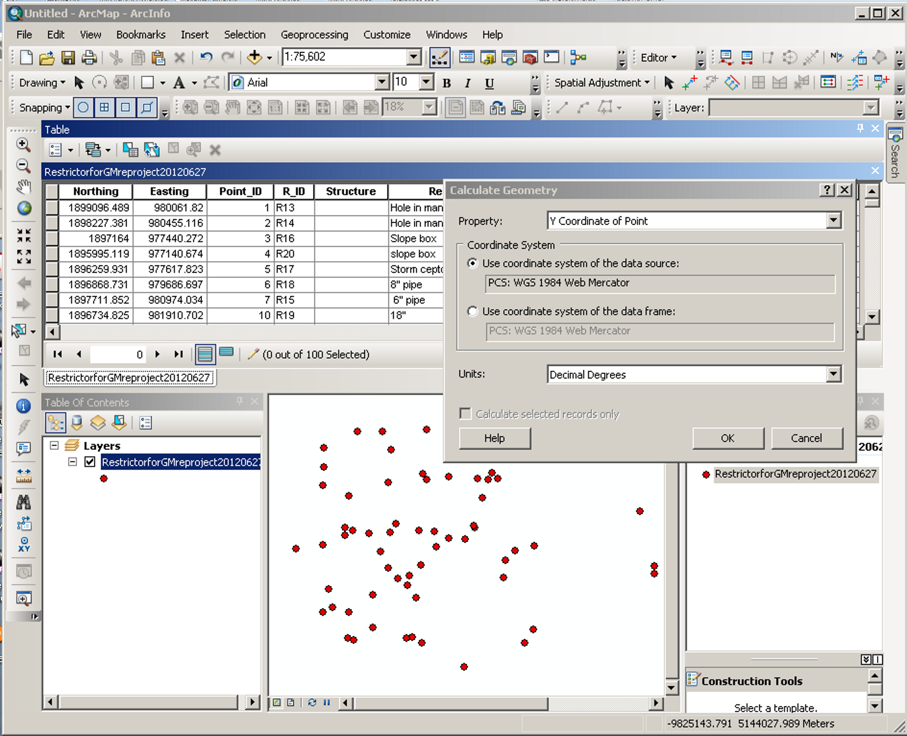
Now we are going to calculate the latitude and longitude. Go to the Editor menu and click “Start Editing.” Then click on the heading “Latitiude” to highlight that field. Right click and choose “Calculate Geometry” from the pop-up menu. The “Calculate Geometry” window will pop up. In this window, set the property for Latitude to the “Y Coordinate of Point.” For the Coordinate System, choose the “Use coordinate system of the data source.” And set the units to “Decimal Degrees.” When you click “OK” the computer will populate the column with the Latitude for each point. Do the same for the Longitude field except the property will be set as the “X Coordinate of the Point.” Then go back to the editor menu and choose “Save Edits” then “Stop Editing.” You now have a feature class on the correct projection for Google Maps with the Latitude and Longitude for each point!
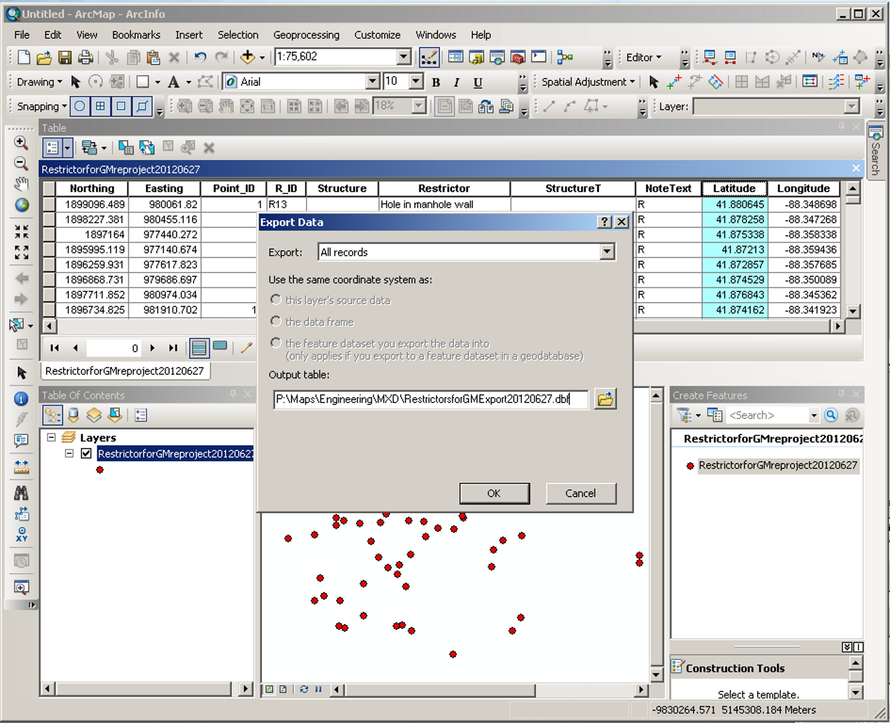
Exporting your data to a database
Now we have to get that data out to a format we can upload to Google. So click on the left most icon in the top of the Table window just under the word “Table.” This should bring up a menu—choose “Export” from this menu which brings up the “Export Data” window. Because we have only one feature class we can leave the Export as “All records.” In the Output table, type in the location and file name you want to assign to the exported data—notice this will be exported in a dbf format.
Creating a spreadsheet and uploading to a Google Fusion Table
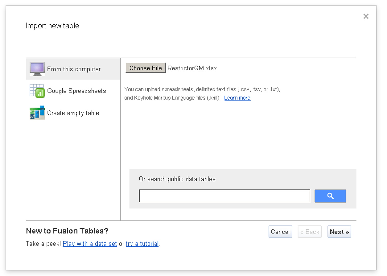
Now, navigate to that new dbf file and open it in MS Excel. Remove any columns you might not need and make any other edits you require (just don’t change the latitude or longitude columns) and save it as a MS Excel file. Go to your Google Documents account and click “Create.” Then from the list of document types, choose “Table (beta).” You will be given the choice of importing a new table from your computer, a Google spreadsheet or create an empty table. We are going to upload our new MS Excel file. Then continue through the prompts until you find yourself looking at your new table.
(In my example, I have renamed my file to something other than the name used in my export to the database. This is because I merged other data into the database once I had it in MS Excel. And it helps remind me the MS Excel file is not exactly the same as the original, exported database file.)
View your data in a Google Map
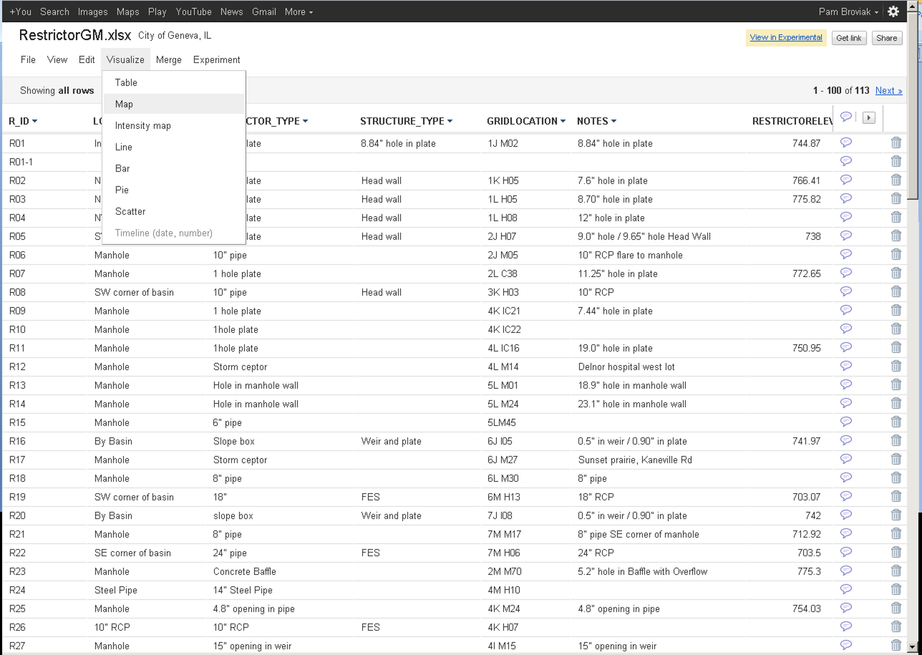
Above is an example of what the Google Fusion Table looks like with your uploaded data. Viewing the points on the map now is as easy as clicking “Visualize” and then “Map.”
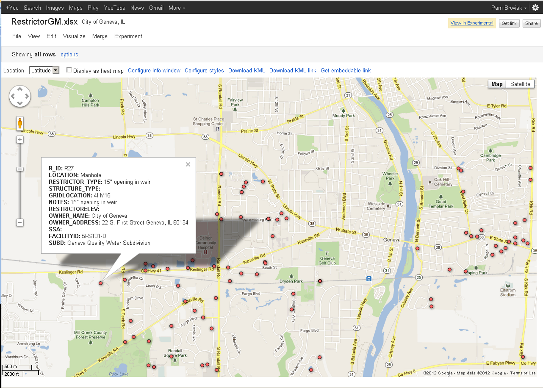
And below is the map of this data—I have clicked one of the points to show the data behind it. You also have the option to configure this info window using html. You can also put links in this window, but so far I've only gotten the link to work to an actual website and not to a local file.


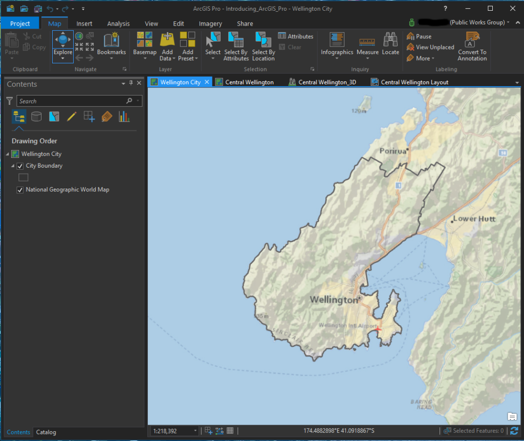 ArcGIS Pro screenshot of a 2D map
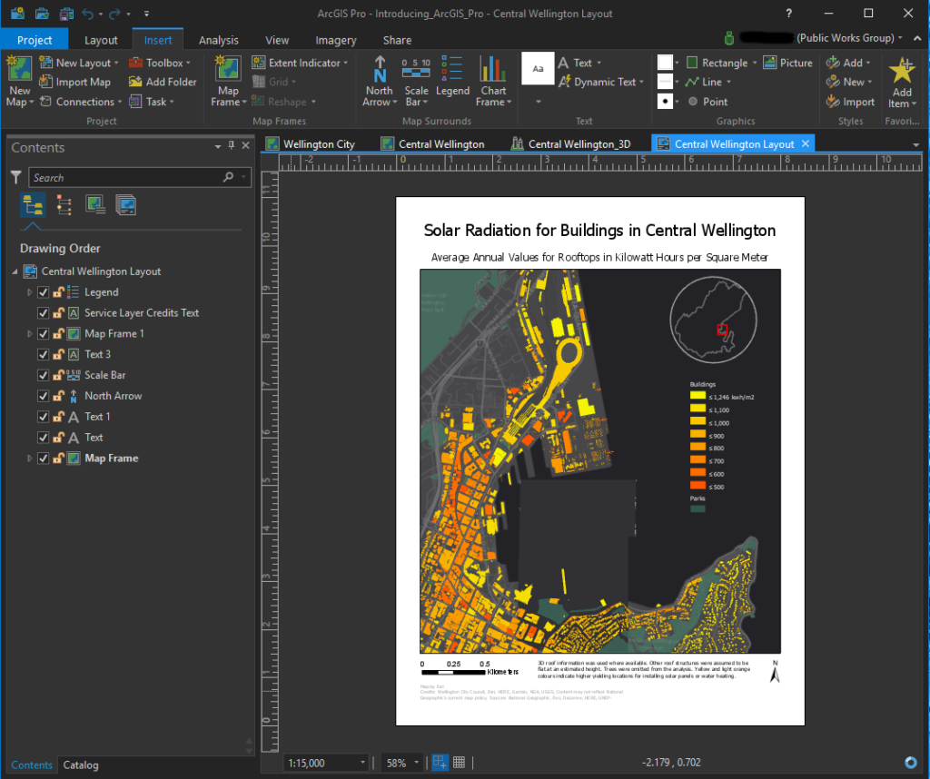 ArcGIS Pro screenshot of a layout
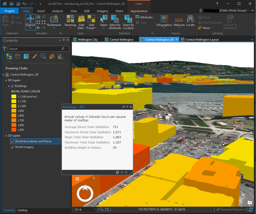 ArcGIS Pro screenshot of a 3D Map with data displayed
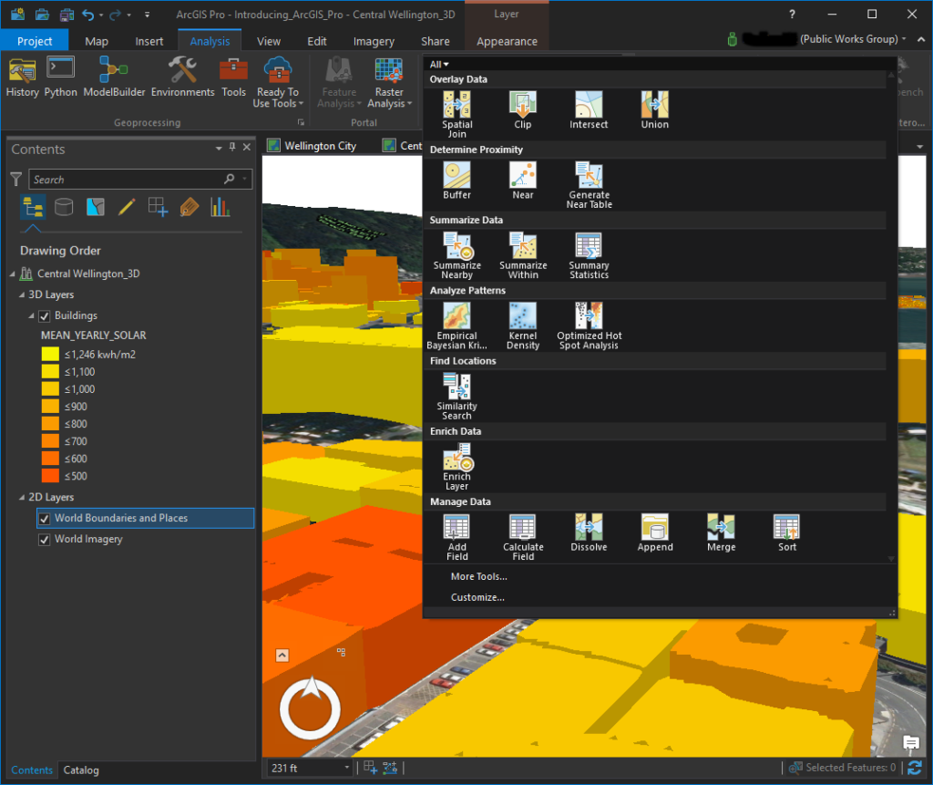 ArcGIS Pro screenshot of available tools in the Analysis menu