Learning New Skills at Civic Design Camp – Chicago 2015

Civic Design Camp 18F Presentation

At today's Civic Design Camp not only did I pick up a few choice bits of advice and skills to add to my civic toolbox, but I also was able to meet and network with some great people including Josh Kalov who I first met at CityCamp in Chicago back in 2010.


Introduction and First Session

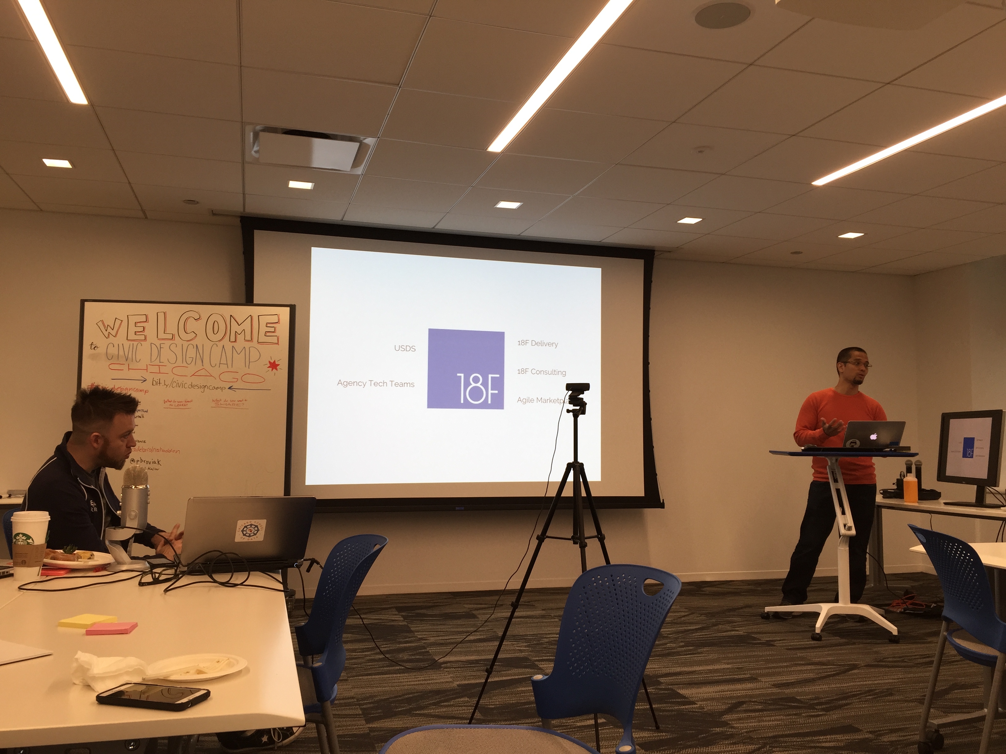
The day started out with an introduction by Cyd Harrell, product director for Code for America, and Christopher Whitaker, brigade coordinator for the midwest region of Code for America. Whitaker is also a consultant for Smart Chicago and helps co-host Open Gov Hack Night in Chicago. After introductions, the discussion was turned over to Raphael Villas who was a Presidential Innovation Fellow and is now with 18F, a group within GSA providing digital services to the Federal government. Villas explained how he made the move from the private to public sector and showcased a few of the projects with which 18F is involved. 

Civic Design Camp 18F Presentation

These projects include:

Communicart – an online service to assist holders of Federal credit cards with purchase approvals and tracking.

MyUSA – a single sign-in service connecting citizens with the U.S. government. The project is still in Alpha, but when finished can assist in linking citizens with any application designed to accept this single sign-on.

USCIS – 18F is working on a streamlined version of the U.S. Citizenship and Immigration Services website. This new site will better direct users to the type of information they are looking for. If you visit the site, you will see it now immediately asks the user the status of their citizenship and offers possible actions or questions.

Let Girls Learn – this site provides information about the collaborative effort between the First Lady and the Peace Corps to promote learning among adolescent girls.

If you want to follow up and learn more about 18F or want to check out their code, you can visit their Github page at https://github.com/18f or their Dashboard at https://18f.gsa.gov/dashboard/.


Visual Design Basics

Next up was Molly McLeod who is with Code for America. She shared with us several good tips for making government documents, forms, and other media more user friendly. I kept thinking throughout her whole presentation how helpful it would be if the engineering industry was given more instruction in this area of study. Many engineers are tasked with preparing documents for use by government agencies, yet most have not had any formal instruction on writing or visual design. The lack of skills in these areas can cause a reader of those documents to either not even bother reading them because it is just too painful to fight through, or the lack of organization and disregard for the end user can leave the reader thinking the author lacks credibility. This lack of credibility can then translate to the government agency for which the document was prepared. So, to improve government documents, designers should always, before writing or preparing anything, answer the questions McLeod posed:

  • Who are your users?
  • What do they need to know?
  • What is the order they need to know it?
  • What are the action steps?

The next step is to make sure you are providing answers to the questions your users might have such as:

  • Am I eligible/is this relevant to me?
  • What info/materials do I need on hand?
  • How long will it take?
  • Key details: deadlines/when/where?

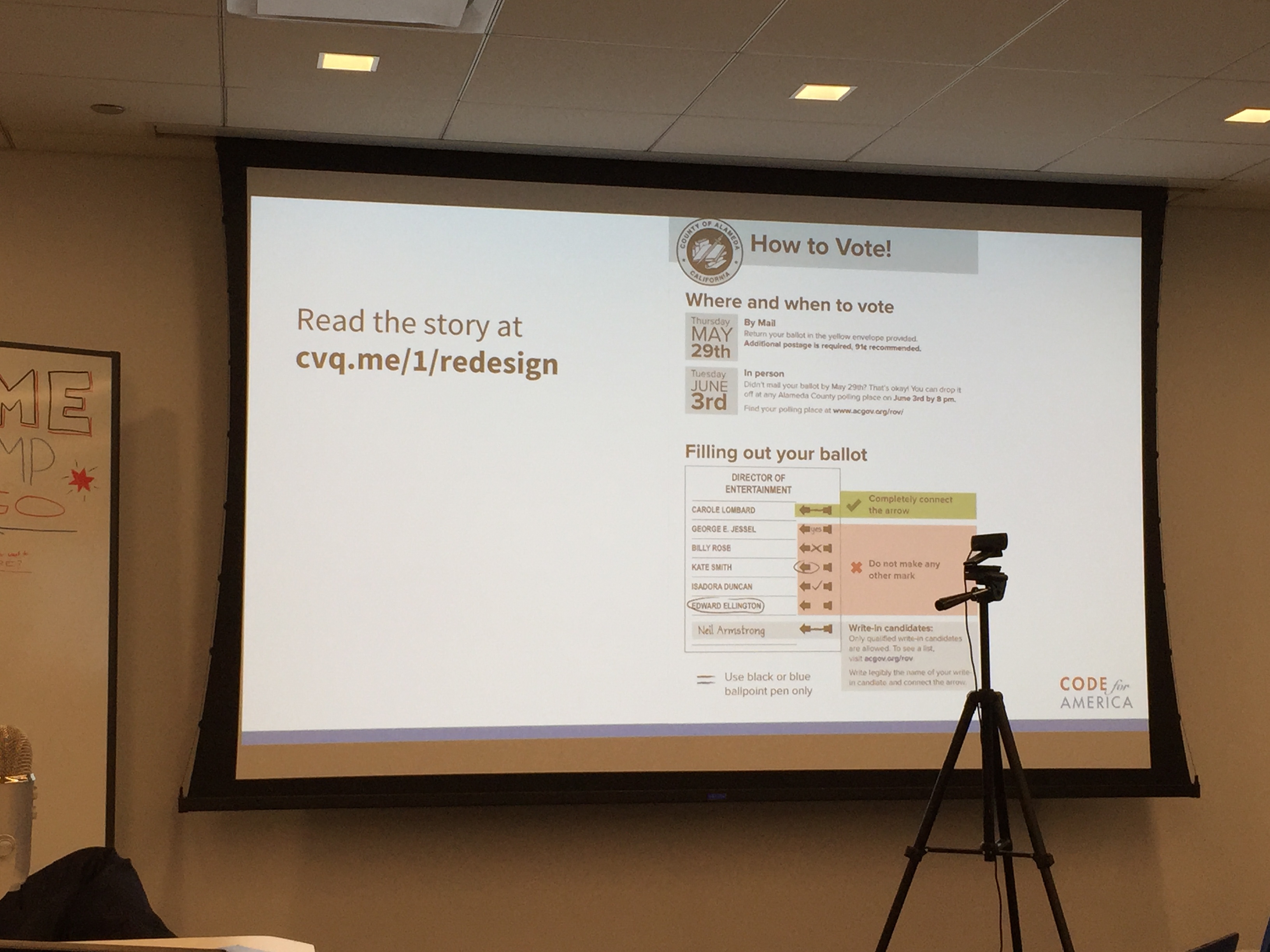
McLeod also offered content tips taken from the Field Guides to Ensuring Voter Intent. And even though the information is focused on communicating information to voters, most of the tips apply to any type of instruction given in a government document. (You can check out the guides yourself by following the link.) Below is a photo of a redesign McLeod did of her county's instructions to voters. If you visit her blog post about this topic, "Let's Respectfully Redesign Government," you can learn more about this redesign and see a side-by-side comparison of her design with the original set of instructions.

Civic Design Camp Visual Design Example

Prototyping Websites using Github Pages

Cathy Deng next showed us how she uses Github Pages to prototype websites. But the added bonus in this session were the other tools she touched on that can also be used to improve or assist in creating sites. While I've worked with website development since the early 1990s and was familiar with Github, these were all tools I have not yet used so it was great to learn about all of them and see a live demo of their features. To start, Deng showed us how to easily set up a website using Github Pages. Basically all you need is a Github account. After that you can follow the directions on the Github Pages site to set up your own website through your account. Here is a link to the very basic site I set up on my own account within only a few minutes following the example: My-Website.

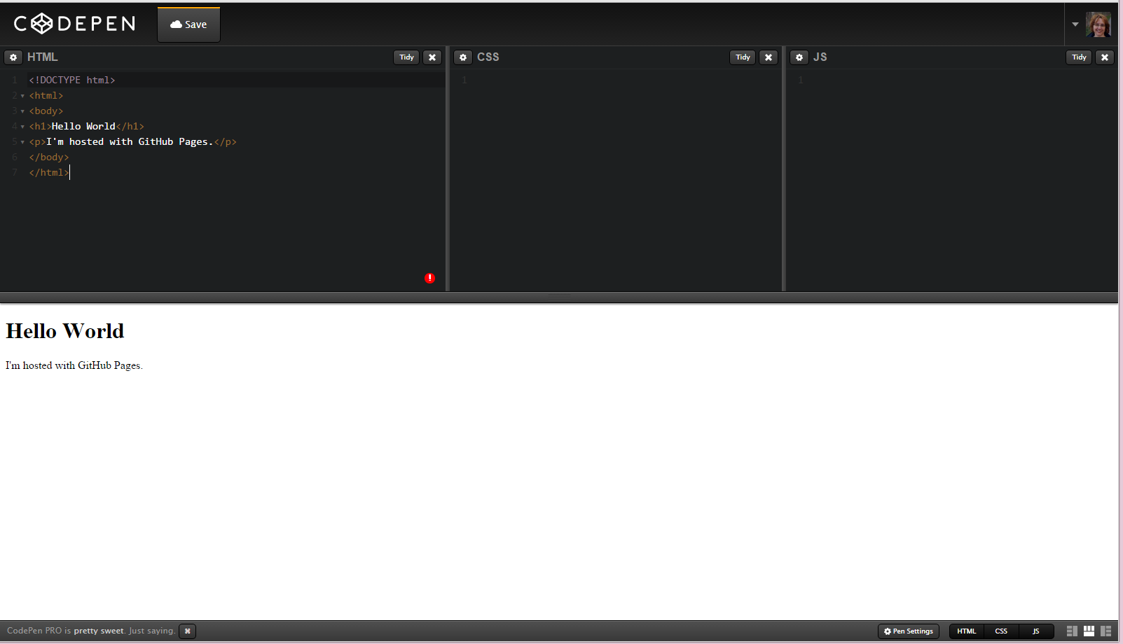
Deng then showed us how we can test out changes to the site's code in Codepen. This tool, which is shown in the screenshot below, allows the user to paste code into the appropriate section – HTML, CSS,  or JS – and immediately preview how it will look in the browser.

Codepen Website Screenshot

The other tool she shared was Bootstrap Components. This site lists many of the items you might want to place on your website such as dropdowns, button groups, headers, progress bars, and many others. If you find the one you want, the code is listed so you can copy and paste it into the code for your site.

The last tool Deng brought into play was Font Awesome. This site, which is also hosted on GitHub, offers numerous vector icons that are scalable and can be added to your site. You can either download them and add them yourself, or you can copy and paste the code that links to the icon on Font Awesome. As the site indicates, "Font Awesome is fully open source and is GPL friendly." You can view Deng's final, simple site she coded during the presentation here http://cathydeng.github.io/my-website/ and access it on Github here https://github.com/cathydeng/my-website if you are interested in forking it over to your own account and experimenting with the code.

Civic User Testing Group

The final presentation I saw was given by Sonia Marziano who is with Smart Chicago and more specifically manages CUTGroup, a civic user testing group in the city of Chicago. Marziano explained how her group arranges testing of websites for developers. Their testing group consists of about 800 residents in the city representing all 50 wards and all 77 neighborhoods. Each participant in the group receives a $5 gift card for signing up and $20 each time they participate in a test.

If you visit the CUTGroup page on the Smart Chicago website, which is separate from the CUTGroup website, you'll find a listing of all the sites the group has tested so far along with very detailed reports analyzing the test results. Marziano was asked if she knew of developers using these results to assist in building better websites. While she wasn't specifically aware of anyone doing that, she did indicate there is enough detail in the write-ups that they could be used for this purpose and believed it would be a great use of the reports. For example, below is the final report from their testing of the Chicago Works for You Website (as an aside, if you haven't ever seen this site, it's worth clicking on over to check it out how Chicago reports their public works related service requests and to see the frequency at which those types of requests are received). I included this one because it focuses on public works related services. If you have a similar site, it might be helpful to read through the user group's reactions and thoughts about their experience with the site:

Marziano also shared some general, overall observations from their testing such as they found very few people click on popovers and that people don't like to have to sign up to access information. She said users will do everything possible to avoid having to share their personal information. They also realized from testing that for autotweets sent to a Twitter user based on specific terms used by that person in a Tweet, it is important to include these types of elements in the autotweet:

  • compassion
  • a question
  • an official element

So for example, if someone sends out a Tweet mentioning food poisoning in the city of Chicago, Foodborne Chicago will send an autotweet that is similar to the following:

"@twitteruser Sorry to hear you're ill. The Chicago health department can help.  https://t.co/kTBNsEJriH"


Final Presentations

I did miss the final presentations because I had to take off to get home in time for other commitments. However, based on posts by other attendees, it looks like the final presentations covered discussion about the Design Thinking for Libraries Website and gifs.


Off-line takeaways

As always in addition to the more formal presentations, I usually pick up some good stuff from others who I meet at an event. Because I was fortunate enough to sit at a table with others who are involved in the transportation industry, I learned a lot about what is going on with Chicago transportation and city business and found out about a few other websites that offer great information. Below are the sites Steve Vance, Abraham Emmanuel, and Josh Kalov shared with me:

Chicago Traffic Tracker – the benefit of this site is the regional map shown in the upper left corner. This small map gives a good overview of the congestion or traffic in an area of Chicago. It can also show how this compares to what is typical for that location and time and it can predict over a 12-hour time period how it will change.

Cook County Property Tax Portal – this site is useful if you have an address or PIN number for a parcel in Cook County. The information offered includes standard property tax information and a listing of the last few property transactions taken from the Recorder's office.

Chicago Cityscape – this site offers information about building permit and business licensing activity in the city of Chicago.

Share

Newly Released Pedestrian Facility Selection Tool

PedestriansLast month, Austroads, the association of Australasian road transport and traffic agencies, released a Pedestrian Facility Selection Tool. According to their website, "the Pedestrian Facility Selection Tool is designed to help Australian and New Zealand practitioners select the most appropriate type of pedestrian crossing based on walkability, safety and economic outcomes." They have produced a User Guide and will be offering more information about the tool at a webinar scheduled for Tuesday, March 10, 2015. The webinar has already filled up, but the site indicates it will be recorded and offered on the website at a later date for viewing.

The tool can be used to assess the following types of pedestrian facilities:

 
  • raised platforms,
  • kerb extensions,
  • median refuges,
  • zebra crossings,
  • signals,
  • grade separation,
  • or combinations of these facilities.

According to the User Guide, the tool can also be used to assess the following:

  • "Puffin signals: the default signal type assessed by the tool, in which all pedestrian green phases are associated with pedestrians actually crossing
  • Wombat crossing (Australia): treat as Zebra with platform and adjust posted/approach speed if required"

You can try out the tool by clicking this link: Pedestrian Facility Selection Tool Link, then reading the necessary guidance and inputs on the page, reading the disclaimer, and clicking the link at the bottom of the page to indicate your acceptance of their terms and to access the tool. Below are screenshots showing the top and bottom sections of the tool.

Pedestrian Selection Tool Top Section


Pedestrian Selection Tool Bottom Section

For each option, "the tool then evaluates pedestrian and vehicle delay, safe sight distances, pedestrian level of service and, using default economic parameters developed for each Australian jurisdiction and New Zealand, calculates a benefit cost ratio." And if you are interested in learning more about the research undertaken to support and develop this tool, you can check out this report: Development of the Australasian Pedestrian Selection Tool.

Share

Using Stationary Bikes to Design Bike Trails

Stationary Bike ScreenAs I ride my bike through some of the grades, curves, and alignments along the bike paths in my area, I often wonder if the person who designed them rides a bike. Because I can't imagine anyone who rides regularly making some of the design choices I encounter. This got me wondering if the designer would have still made those same choices if they had to first ride their design before building it. Of course, up until recently this really would not have been possible. But thanks to newer technologies, this type of design tool could probably be implemented today, and here's how I'm thinking it could be done.

Let's say I am given a project with the goal of designing a bike facility. This route could consist of a shared use path or an on-road facility or a combination of both. I would begin with a fairly traditional approach of analyzing potential alignments. Then after choosing one or more proposed routes, I would arrange to have these alignments surveyed, bring them into a CADD program like Autodesk Civil 3D, and start developing my design for each alternative. At this point, the final alternative would be chosen by analyzing the route for impacts, costs, public opinion, access to specific destinations, property acquisition issues, and other typical factors we usually consider when finalizing a design. The downside of this approach is that the actual performance of the facility can never be assessed. It is just assumed that if the engineer followed the same design criteria for each alternative, they would all perform in a similar manner. However, based on specific environmental conditions or design choices, this might not necessarily be true. Then it is not until the route is built and the money is spent that the users realize there are some issues with the design. So how can we use newer technologies to overcome this inability to assess our design before actually building it?

During the stage in which we analyze the alternatives, we could export a 3D model of our design. Then we could upload it to a stationary bicycle that has a screen display of our route. The computer on the bike would then pick up the design parameters such as slopes, lengths of segments, curves, etc., and then program the bike to react to those parameters. So if I have designed too steep of a slope for too long of a distance, it will become very obvious as I actually bike that route. And while this could be done simply to analyze only the design of the path, other models such as terrain, trees, intersections, and buildings along with environmental conditions such as wind, sunlight, and perhaps even traffic flow could also be added to allow for a more detailed analysis of how the environment impacts the path. In addition to having the engineer bike their own design, potential users of the path who span a whole range of abilities could also bike the design and offer input and comments.

So how close are we to being able to do this? I suppose that is a question for the companies manufacturing stationary bicycles. I know they can take a route and project it on the screen as you can see in the photo at the beginning of this post. And I know they can adjust the bike for grade/resistance. But can they read essentially what would be metadata about the images being displayed and use that to control the grade? I don't know with the current bikes, but I am sure if it's not possible now, it could definitely be programmed to function in this manner. As for exporting a file from Civil 3D that could integrate with a stationary bike in this manner, I would think based on how innovative Autodesk has always been that company would have no problem figuring this out.

And even though my main thought in all this was to help us design better bike facilities, it also made me wonder if something like this could lead to a whole new industry for civil engineers in which we design virtual bike experiences for stationary bikes too! 


Share

Improving Bicycle Path Design

Over the last year or so we've logged significant mileage on our bikes. While one outcome has been the expected increase in personal fitness, another has been better awareness and insight into design of bicycle facilities. Most of the paths along which we ride have been in place for many years so were probably designed under older guidance, but I am still not sure that all of the issues we've noticed have yet been addressed by more recent bicycle design manuals. So I wanted to share a few of the problem areas we have identified to see if anyone else has figured out or has any comments for some best practices or guidance to improve these aspects of design:

Tree impacts to the path

Root Damage on Bike Path

A lot of off-road paths are lined by trees. This can create a few issues that could cause a cyclist to fall and possibly be injured. This can occur in the colder climates because trees drop leaves that can pile up and become slippery if not cleared. Trees also drop seeds such as acorns or walnuts. Hitting these the wrong way could cause a cyclist to lose balance and fall. I know of at least one agency that regularly sends out a small sweeper about once a week to clear debris, particularly in the fall and that maintenance activity appears to keep the path in that area fairly clear.

Trees can also cause damage to the path from roots. As you can see in the photo here, someone has marked areas of the path where trees have caused the path to heave. If a cyclist did not see these bumps, they could lose balance and fall.

The tree's proximity to the path can also cause a potential for problems. As shown in the photo, trees are often located very close to the pavement. If too close, the trunks of the trees can also grow into the pavement. One day when we were riding in another area of this trail, we saw a cyclist miss navigating a curve and hit a tree that was very close to the path. He fell and fortunately was not hurt. But it made us wonder if there should be a clear zone for bike paths similar to the concept used for roadway design. The Washington State Shared-Use Path Design Manual does call for a horizontal clearance of two feet (page 1515-5). 

Roadway approaches

A lot of the trails we ride follow a river so quite often we end up having to navigate steep slopes when the path changes course away from the river. There have been a few instances where it seemed the designer could have mitigated the slope by lengthening out the transition, but instead took the shorter route which resulted in a slope almost steep enough to require us to dismount and walk our bikes. We've also wondered why when a bike route we follow is moved onto streets, the steepest street in the area is chosen for the route. One of the roads we ride along is so steep we definitely have to get off our bikes and walk them a block or two until the route turns down another, flatter street. I realize the calculation for bike level of service does not take into account grade – probably because it was developed in Florida along flat routes – but if I have to get off my bike, I am no longer able to use it as a bike route which would seem to mean a complete failure of that bike facility. So I definitely believe grade should be incorporated into the Bike LOS calculation. 

The other problem with steep slopes is that they require a lot of energy and momentum to ride up. And because many paths we bike along seem to have been designed with a steep slope immediately adjacent to an intersection with a road, we end up going up the slope approaching the road at a high rate of speed and with a lot of momentum then have to slam on the brakes immediately as we hit the road. I always wonder how we appear to the cars that are approaching the crossing. I would think it looks like we are not going to stop. The other problem with this design is there is usually no flat area at the top of slope at the road intersection. So as you wait for the cars to go by, you are sitting on that steep slope which makes it even more difficult to start moving again and quickly pedal across the road. A better design would seem to be to pull back the slope slightly and allow for a flatter area at the top where the path intersects the road. The question would be what distance would work best here? Another consideration would perhaps be to give a widened area at these intersections to allow for several users to queue while they wait to cross.

The other area where slopes seem to cause problems is at stream crossings. On the paths where we ride, there are many of these crossings and usually the downgrade is very steep on both sides of the bridge. So the ideal approach would be to ride fast down the hill and across the bridge so we have enough momentum to assist in making it up the hill on the other side. Unfortunately most of the designs have brought the slope down almost to a "V" at the edge of the bridge instead of designing in a gradual vertical curve. And because the joint where the asphalt path meets the bridge is not always smooth, we end up having to reduce our speed to make it over this severe change in grade that might also have a bump. So the only distance we have to build up speed again is across the short bridge which usually isn't enough.

Sight distance

It seems that there is some guidance out there for sight distance, but that doesn't help riders on paths that were built with no thought to this design consideration. Perhaps on older facilities, agencies responsible for the paths could go back and assess their facility and add in striping or signs to let cyclists know there are potential sight distance problems in a specific area.


Adjacent surfaces

Surface material of areas adjacent to bike paths can cause damage to the path or unsafe conditions for users of the path. For example, one trail we ride is located next to a gravel parking lot near a school. After riding through here a few times, we've gotten to the point where we now remain in the road through this section because there is always a lot of gravel on the path. This appears to be due to the drainage design and grades of the road, lot, and path in this location. As water flows from the road and across the lot, it picks up gravel from the parking lot. Then as the water flows across the path, the gravel drops out onto the asphalt, possibly because the path looks like it could be a localized low area. The gravel on the path is difficult to ride over and can cause instability to a cyclist which can result in them falling and possibly getting injured.

Gravel along bike path

Path Material

Path material is definitely an important component of a bike path. There is a path we ride along, or I should say used to ride along, where the agency decided to place asphalt grindings over the crushed gravel that was initially placed as the surface. Grindings are definitely a material that should never be used for a shared used path or even a dedicated bike path. There are usually few fines in it unless it has been processed to have fines added which usually isn't the case. So riding along a path made with grindings ends up somewhat similar to the experience of riding on marbles. We also came across another path where an agency had placed sand. Riding in sand is also not very easy. So as you can see in the photo below, people appear to avoid it by walking their bikes through the grass which is exactly what we did. The FHWA provides some guidance on surface materials for shared-use paths as part of their Designing Sidewalks and Trails for Access Part II of II: Best Practices Design Guide.

Bike Path with Sand


Signage
 
Another issue we noticed along many bike paths is a lack of directional signage. One day last year, I decided to go on a 30+ mile bike ride that took me along many routes with which I was not familiar. One particular route required me to transition between trail and roadway several times. Unfortunately it was difficult to navigate using my phone since it was having battery issues and didn't make it through most of the trip leaving me stranded with no map. Fortunately there was another cyclist who knew exactly where to go to get off one trail, make our way through a maze of streets and connecting trails and manage to end up where two main trails picked up again. And he was nice enough to realize I was lost and needed his guidance. Just a few well placed signs would have really helped me find my way because I really can't go biking on a regular basis hoping there will be a nice person there who knows the way and will help.
 
 
Share

Can a Non-Engineer Public Works Director Make Engineering Decisions?

Over the last few days I’ve been once again attending the Illinois Public Service Institute, a three-year training program for public works professionals in Illinois. Last year, I wrote a post about the incredible experience I had in my second year, and over the next few days or month, I am hoping to write a few articles about what I’ve learned this year.

The first topic I wanted to touch on in this short post came up during a discussion that occurred at my table while we were working on an assignment. Another engineer brought up the following scenario which caused me to wonder about how this should be handled:

A licensed, staff engineer develops a design for a set of plans that eventually he or she will stamp with their license. Their direct supervisor, the city engineer, who is also a licensed engineer, disagrees with the design and proposes a different design approach. Because the two engineers cannot come to an agreement, they take both design ideas to the city engineer’s supervisor who is the director of public works and who is not an engineer and who does not have any engineering training. Both engineers present their designs then allow the director to choose which one will be used for the plans.

I do realize with both engineers being licensed, most likely both designs are acceptable. However, if the decision is entirely based on the engineering merits of the design, how is someone who has no background or training supposed to be capable of making that decision, and is it ethical or professional to be doing so?
Also, I wondered does it make a difference if the staff engineer is stamping/signing the plans? I would think ultimately the city engineer, if an appointed official for the city, is responsible for the department’s designs, but the staff engineer seems to carry the professional liability for the design if he or she is stamping the plans.

I was curious what other engineers would think of this so would be very interested in hearing opinions or ideas or past experiences or policies related to this scenario.

Share

3D Visualization of an Alley Streetscape Project

Downtown alley looking westA while back I was working on a project to change an alley from a typical asphalt driveway to a pedestrian walkway. Because it is in a downtown area, this project allows for many design opportunities to enhance the downtown area and the pedestrian experience. During its planning stage, we had a lot of input from property owners, co-workers, and others in the community on what they wanted to see in that space. But as I put together the civil drawings, I thought it would be so much better to also have a 3D view of it so we could actually see what it would look like when we put in everyone's ideas. I decided the easiest and fastest way for me to build the best looking model for this was to use something like Opensim or Second Life software. Due to the size and purpose of this project, I ended up setting it up in Second Life since I could make it in a premium sandbox, take a photo of it when done, and then store it in my inventory. Below is the result of my work.

Downtown Alley in 3D

If you look close, you will probably notice it really is not a perfectly executed model. This was intentional on my part. For this particular project, my goal was to see how fast I could set up a model that while not perfect was good enough for visualizing a design.This is because when I have built things like this before, one of the main questions I get from co-workers and other engineers is "how long did it take you to do that?" And in the past, I never really paid attention because I was more focused on the building aspect and trying to make it look exactly like the actual site. But for professional design work, time is one of the most important considerations. So I wanted to focus on how fast this could be done yet still achieve the goal. In the end, for this project, which covered roughly 30 feet by 400 feet, I would say it took about eight hours to take the photos, create the textures, and build the model. I might have been able to finish it sooner, but it took me a while to shop for the string lights and buy them in a Second Life store.

Here are a few more photos with different lighting and different views. Obviously with more time, a lot more elements could have been added and more ideas tried. The good thing about having a model like this is once it is built, it is so easy to just add other objects or try different designs:


Alley 3D Visualization Looking East

Alley 3D Visualization Looking West at sunset

Share