Infographic of the Month – June 2013

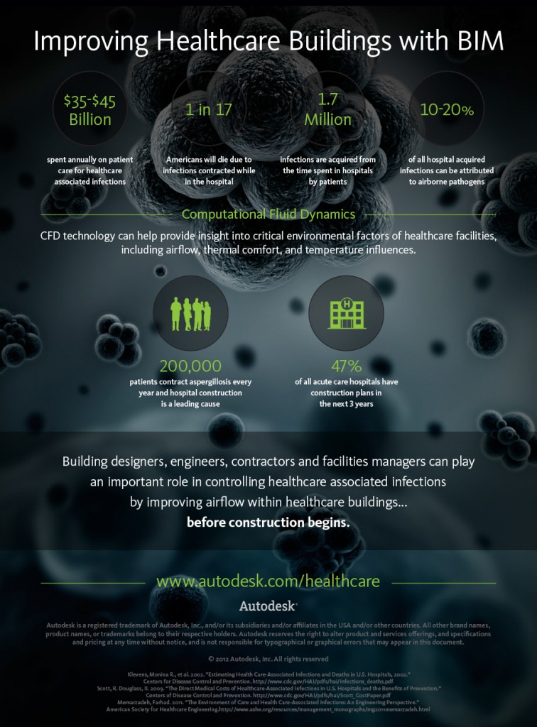
This month's infographic, Improving Healthcare Buildings with BIM, is brought to you by one of my very favorite companies, Autodesk. Just like infographics, BIM makes use of visualization techniques to convey a message in a more interesing way that makes ideas easier to understand.

Improving Healthcare Buildings with BIM from Autodesk

If you have an interesting infographic related to public works or any other topic typically covered by the Public Works Group and want to have it featured as Infographic of the Month, just send it to pwg@publicworksgroup.com.


Share

Infographic of the Month – May 2013

Yesterday a colleague at work and I were discussing the feasibility of creating infographics to use as exhibits at public meetings for projects. We didn't necessarily think they should be used in place of what is already done, but instead used to enhance understanding of the project. But we could not think of any examples where we had seen public agencies using infographics in this manner. I'm going to reach out to a few people I know in the industry to see if they are aware of anyone using infographics at public meetings for projects, and if any of you out there are familiar with an example, we'd love to hear about it.

In the meantime, I thought I'd share an infographic with you that I received in the email yesterday from EDR. It focuses on the topic of vapor intrusion. You can find out more about that topic on the EPA Vapor Intrusion page. And if you want to embed this infographic on your own page to help educate citizens in your own community you can grab the embed code on the Vapor Intrusion Infographic page.

What Homeowners Need to Know About Vapor Intrusion – An infographic by the team at EDR


Share

Engineering Infographics

Infographics are large sized, graphic-filled images used to convey sometimes complex ideas or information. Over the last year or so they seem to have risen in popularity and have been produced and shared by a wide variety of industries. So it was only a matter of time before we started finding engineering-related infographics. The one below was created by bestonlineengineeringdegree.com and presents several engineering achievements:

How Did They Do That?
Source: Best Online Engineering Degree

Here's a nice one from the University of Singapore that simply shows the answer to a common question from students:


If you want to try to make your own infographic, there are sites listed at the end of this post to get you started. You can try making an infographic to showcase your product, inform citizens about a project or new ordinance, or just convey some important information or facts to the public. If you make one, we'd love to see it – send it in and we'll share it on our blog.


Infogr.am

Visual.ly

easel.ly


Share